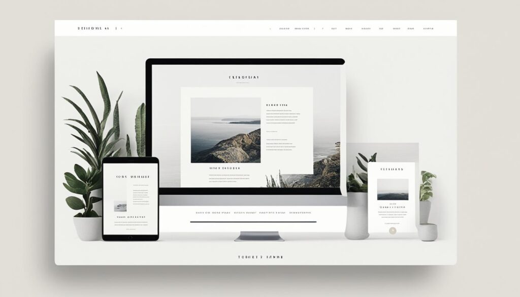
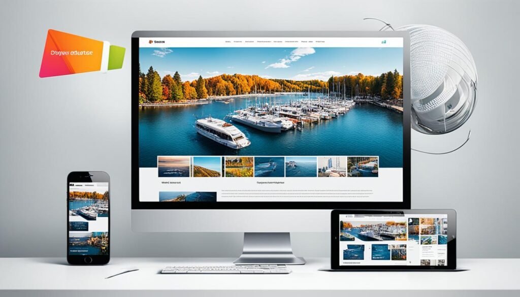
In our fast-changing digital world, responsive web design is a must-have. More people are using smartphones and tablets. Websites must work well on any screen to keep users happy. This includes making sites that fit small or large screens without losing quality.
Designers use many methods to improve user experience. They often start with mobile devices in mind. They also add live content and videos for a better feel. Their goal is to make sites that work well, look good, and are easy to use for everyone.
This article will look at how responsive web design makes browsing awesome for users. We’ll cover starting with mobile designs and adding smart features, like AI. With these and other strategies, designers turn websites into exciting places to be online.
The Mobile-First Approach in Responsive Web Design
The world is shifting to mobile devices as the go-to for internet use. So, responsive web design now starts with a mobile-first approach. Here, the focus is on designing for mobiles before working on desktop views. This way, websites offer smooth and intuitive experiences on all screens. Responsive web design first targets mobile devices.
Today, many folks access the web mainly through smartphones. For them, designing with mobiles as the first thought is key. It means putting the most important content and features first. This makes it simpler for users to get around your site on their smaller screens.
This method helps designers build sites that look great not just on mobiles but on bigger screens too. It’s about smoothly adapting for all sizes, not just adding on for desktops later. The result is better user happiness and a consistent experience everywhere.
Starting with mobiles also helps make web pages faster and more efficient for mobile users. By keeping things simple and focusing on what’s crucial, sites load quicker on phones. This leads to a better overall performance on mobile devices.
Thinking with a mobile-first mindset makes you carefully consider what matters most to those using smaller screens. It leads to cleaner and simpler designs and fewer distractions. With this strategy, websites make sure their key info is right there for mobile users, boosting their engagement.
Designing for mobiles does more than improve user experiences. It also aligns you with how people use the web today, mostly through their phones. A mobile-first approach is now a must to meet the demands of today’s users.
Minimalistic and Clean Designs in Responsive Web Design
Today, minimalistic and clean design is a top trend in responsive web design. It focuses on making websites load faster and improving how users interact with them. By simplifying the design, visitors can easily find what they’re looking for. This design also makes it clear what’s most important on the page. So, navigating the website on any device is a smooth experience.
Responsive web design shows us that simplicity is powerful. A minimalist approach means using lots of white space, basic colors, and straightforward ways to move around the site. This doesn’t just make a site look good. It also speeds up how fast pages load.
Benefits of Minimalistic Design
One big plus of minimalistic design is quick loading times. With less stuff on each page, sites open up faster. This keeps people from leaving before they even start looking around. In a world that moves so quickly, this is super important.
Simple, uncluttered designs also help users focus on what’s important. They put essential info front and center. This means users easily find what they’re after without any confusion.
Minimalist websites are easier to read, too. They use clear fonts and make sure the text isn’t too crowded. So, no matter what device someone is using, reading the site is a breeze.
But there’s even more to love about going minimal. It helps with SEO, meaning your site might show up on search engines more. That’s because search engines like sites that are easy to use. Plus, they can more easily explore and understand your site.
Taking a minimalistic approach isn’t just good for users. It’s a smart move for brands, too. It shows you care about how people interact with your site. And, it helps get your message across clearly and quickly while leaving a lasting impression.

Typography and Readability Optimization in Responsive Web Design
Choosing the right words and how they look is key in web design. For a website to look good, the fonts must be easy to read. This way, people can read the text clearly no matter what size the screen is.
Fonts that can change size and still be readable are very important. They make sure readers have an easy time, whether they’re on a phone, tablet, or computer. This keeps the reading experience smooth across all platforms.
Line spacing and contrast are crucial for making content readable. Spacing out the words properly stops them from being too close and hard to read. High contrast helps texts stand out, even on the best screens.
The Importance of Typography in Web Design
Typography defines a website’s style and brand. Choosing the right fonts helps tell a website’s story. It can make a site look beautiful and still be clear to understand.
It’s important for fonts to be unique but easy to read. Fancy fonts make a website interesting but they shouldn’t be too hard to read. If people struggle to read, they might leave the site.
How the text is arranged matters a lot, too. Using different font sizes and styles shows what’s most important on a page. This guides readers and helps them understand what they are seeing.
Good text design is essential for modern websites. Sites with easy-to-read fonts, proper spacing, and clear hierarchy are more inviting. These details help everyone who visits the site enjoy what they see and read.
Dynamic Content and Media in Responsive Web Design
In today’s online world, dynamic content is key in web design. It involves animations, videos, and small actions that make sites more fun and informative.
One big plus of such design is how it fits any screen size. Whether it’s a big computer or a small phone, users get the same great experience. This means everything looks good and works well, no matter the device.
Interactive features like animations and videos make sites more interesting and fun. They catch your eye and guide you around. Videos can show off products in an exciting way, while small actions add a personal touch to browsing.
Benefits of Dynamic Content and Media in Responsive Web Design
1. Enhanced User Engagement: Interactive features draw people in and make them want to explore.
2. Improved User Experience: Fun and informative content makes browsing a joy.
3. Increased Conversions: Keeping users interested can lead to boosted sales and business success.
4. Visual Appeal: Websites look better and stand out more with dynamic content.
5. Seemless Adaptation: Designs flow smoothly on any device, big or small.
Take a look at this example to see creative use of dynamic content in web design.

Embracing dynamic content can transform how users see your website. Animations, videos, and interactive tools make browsing a delight.
Gesture-Based Navigation in Responsive Web Design
Touchscreens are everywhere, making gesture-based navigation very popular in web design. It involves using swipes, pinches, and taps to move through a website. This makes browsing smooth and fun for everyone.
This design method lets people easily interact with sites on their phones or tablets. It makes websites user-friendly, improving how satisfied users are and how much they enjoy the site.
Imagine swiping between images, pinching to see a product closer, or tapping to see more content. These actions are like second nature and make exploring a website easy and enjoyable.
Using touch, you can move around a website quickly, without needing any buttons. This makes the site look less cluttered, creating a more beautiful design.
Gestures take user experience to a new level by making websites easy to use. They match how people naturally want to interact with technology. This approach provides a seamless way to find the content you want.
As we look for even better online experiences, gesture-based navigation is key. Designers and developers can use this method to make websites that are a pleasure to visit on any touch device.
Artificial Intelligence and Personalization in Responsive Web Design
Using artificial intelligence (AI) in web design opens new doors for personal experiences. By using AI algorithms, websites can learn about what users like. They then show users content and recommendations that are just right for them. This makes the site more enjoyable for visitors.
Responsive design is essential for making sure every device offers a great experience. No matter if it’s a desktop or a phone, users will see content suited to them. This keeps them interested and meets their needs effectively.
AI and personalization lead to more specific content for each user. With smart algorithms, websites can show info that matches the user’s needs. This not only boosts their interest but also helps in making them act, like making a purchase, and feel satisfied.
Additionally, AI gives websites a peek into what users really like, in real time. This helps them get better at personalizing content. By learning from how users interact, sites can tweak their approaches. This way, they can make every user’s visit more unique and appealing.
By adding AI and personal touch to responsive designs, sites can be very user-focused. They understand what users like and offer suitable content. Hence, users have a better experience, finding what they need easily, no matter their device.
Dark Mode and High Contrast Themes in Responsive Web Design
Dark mode is now a big hit in web design. It looks great and feels modern. It’s also good for your eyes in the dark. This design change makes websites more appealing and easier to look at in various lighting.
Dark mode is also kind to your device’s battery. Screens with OLED or AMOLED tech use less power showing dark colors. Thus, dark mode helps your device last longer between charges.
Responsive design makes dark mode work well on all screen sizes. It looks good whether you’re on a big screen or a small one. High contrast themes also help make content clear and easy to interact with for everyone.
Designers must pick colors and fonts carefully for dark mode. The right choices keep everything readable and attractive, no matter the size of your screen. This attention to detail ensures a good user experience.
By adding dark mode, websites meet user demands and increase their appeal. These design changes don’t just follow trends. They show a dedication to making digital spaces both pleasant and usable for all.
Illustration of a mobile device displaying a website with dark mode enabled.
Conclusion
Responsive web design always changes for the better in the digital world. It all starts with making sites work well on phones, using simple and clear designs. This makes visiting sites on any device a joy.
Good web design also means making text easy to read and adding interesting content. From moving images to swipe-based movement, every detail matters. Even smart technology plays a big role in making websites that feel personal and smart.
Remember, dark mode and high contrast settings are not just cool but they also help save battery. Plus, making sites anyone can use, and maybe adding virtual or augmented reality, makes the web a better place for everyone.
For those in web design, keeping an eye on the latest trends is critical. These efforts ensure that our websites are welcoming, no matter the gadget or the person using it. The digital world is our oyster, ready for all to explore.